这篇“微信小程序如何实现底部弹出框封装”文章的知识点大部分人都不太理解,所以小编给大家总结了以下内容,内容详细,步骤清晰,具有一定的借鉴价值,希望大家阅读完这篇文章能有所收获,下面我们一起来看看这篇“微信小程序如何实现底部弹出框封装”文章吧。
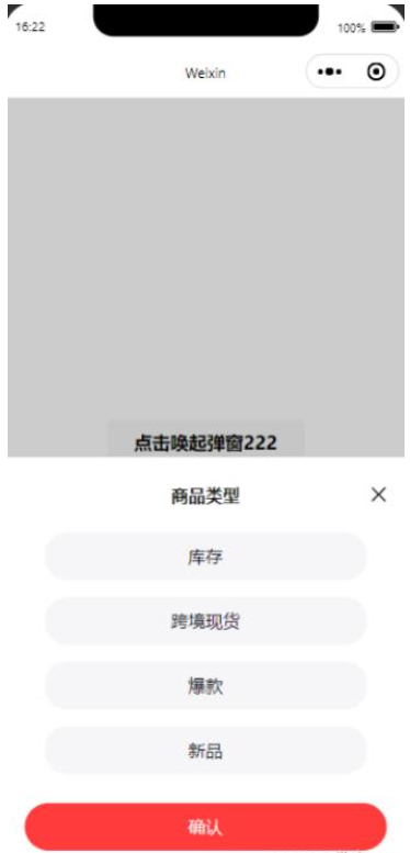

<!--index.wxml-->
<view>
  <button  catchtap="changeRange2">点击唤起弹窗222</button>

  <!-- 弹框 -->
  <dialogA id='dialog' catchtouchmove="preventTouchMove" bind:customEventHandler="customEvent"></dialogA>
</view>
{
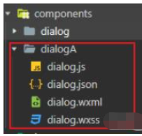
"usingComponents": {
"dialogA":"/components/dialogA/dialog",
"dialog":"/components/dialog/dialog"
}
}// index.js
// 获取应用实例
const app = getApp()
Page({
/**
* 生命周期函数--监听页面初次渲染完成
*/
onReady: function () {
this.popup = this.selectComponent("#dialog"); //获取
},
// 调用子组件事件---弹窗2
changeRange2(e) {
var _this = this;
_this.popup.changeRange(); //调用子组件内的函数
},
})
<!--components/dialog/dialog.wxml-->

<view class="half-screen" catchtouchmove="preventTouchMove">
    <!--屏幕背景变暗的背景  -->
    <view class="background_screen" catchtap="hideModal" wx:if="{{showModalStatus}}"></view>
    <!--弹出框  -->
    <view animation="{{animationData}}" class="attr_box" wx:if="{{showModalStatus}}">
        <view class="dialog-box">
            <view class="dialog-head">
                <view class="dialog-title">商品类型</view>
                <view class="close2ImgBox">
                    <image src="/img/close2.png" class="close2Img"  catchtap="hideModal"></image>
                </view>
            </view>
            <view class='dialog-content'>
                <view class="select-box">
                    <view wx:for="{{tabData.val}}" wx:key="index" class="select-item {{index==tabData.toValIndex?'selectedItem':''}}" data-dialogid="{{index}}" catchtap="getValueTap">{{item}}</view>
                </view>
                <view class="btnBox">
                    <button class="btn" catchtap="hideModal">确认</button>
                </view>
            </view>

        </view>
    </view>
</view>
/* components/dialog/dialog.wxss */
/*模态框*/
/*使屏幕变暗 */
.background_screen {
width: 100%;
height: 100%;
position: fixed;
top: 0;
left: 0;
background: #000;
opacity: 0.2;
overflow: hidden;
z-index: 1000;
color: #fff;
}
/*对话框 */
.attr_box {
background: #FFFFFF;
opacity: 1;
/* border-radius: 0px 0px 0px 0px; */
/* height: 500rpx; */
height: auto;
width: 100%;
overflow: hidden;
position: fixed;
bottom: 0;
left: 0;
z-index: 2000;
background: #fff;
/* background: rgba(66, 66, 66, .6); */
padding-top: 40rpx;
padding-bottom: 90rpx;
box-sizing: border-box;
}
.dialog-box {
width: 100%;
height: 100%;
/* background-color: pink; */
}
.dialog-head {
display: flex;
justify-content: flex-end;
align-items: center;
height: 60rpx;
/* background-color: rgb(215, 255, 192); */
}
.dialog-title {
width: 80%;
height: 100%;
font-size: 32rpx;
font-family: PingFang SC;
font-weight: bold;
/* line-height: 40rpx; */
color: rgba(0, 0, 0, .9);
/* background-color: rgb(255, 254, 192); */
display: flex;
align-items: center;
justify-content: center;
}
.close2ImgBox {
width: 10%;
height: 100%;
display: flex;
align-items: center;
}
.close2Img {
width: 44rpx;
height: 44rpx;
}
.dialog-content {
height: calc(100% - 60rpx);
/* background-color: rgb(192, 237, 255); */
box-sizing: border-box;
padding: 40rpx 0;
}
/* 主体内容 */
.select-box {
/* background-color: rgb(240, 230, 146); */
display: flex;
flex-wrap: wrap;
justify-content: start;
box-sizing: border-box;
padding: 10rpx;
padding: 0 0 30rpx 0rpx;
box-sizing: border-box;
display: flex;
flex-direction: column;
justify-content: center;
align-items: center;
}
.select-item {
width: 80%;
height: 88rpx;
line-height: 68rpx;
background: #f6f5f8;
opacity: 1;
border-radius: 40rpx;
text-align: center;
font-size: 32rpx;
font-family: PingFang SC;
font-weight: 400;
color: #151521;
/* margin-right: 10rpx; */
margin-bottom: 32rpx;
box-sizing: border-box;
display: flex;
justify-content: center;
align-items: center;
}
.selectedItem {
background: #ff5050;
color: #fff;
border: 1px solid #ff5050;
}
.btnBox {
width: 100%;
/* height: auto; */
display: flex;
justify-content: center;
align-items: center;
}
.btn {
width: 90% !important;
height: 88rpx;
background: #FF3B3B;
opacity: 1;
font-size: 32rpx;
font-family: PingFang SC;
font-weight: 500;
color: #FFFFFF;
opacity: 1;
border-radius: 48rpx;
border: none;
outline: none;
position: absolute;
bottom: 50rpx;
left: 50%;
transform: translate(-50%, 0);
display: flex;
justify-content: center;
align-items: center;
}// // components/dialog/dialog.js
Component({
/**
* 组件的属性列表
*/
properties: {},
/**
* 组件的初始数据
*/
data: {
//弹窗显示控制
showModalStatus: false,
// isShowDialog: false, //是否显示提示控件组件
// 点击添加的数据
tabData: {
// title: '拒绝发货',
val: ['库存', '跨境现货', '爆款', '新品'],
toValIndex: null,
}, //需要传递的值
},
/**
* 组件的方法列表
*/
methods: {
//点击显示底部弹出
changeRange: function () {
this.showModal();
console.log('我是弹窗打开----');
},
//底部弹出框
showModal: function () {
// 背景遮罩层
var animation = wx.createAnimation({
duration: 50,
timingFunction: "linear",
delay: 0
})
//this.animation = animation
animation.translateY(50).step()
this.setData({
animationData: animation.export(),
showModalStatus: true
})
setTimeout(function () {
animation.translateY(0).step()
this.setData({
animationData: animation.export()
})
}.bind(this), 50)
},
//点击背景面任意一处时,弹出框隐藏
hideModal: function (e) {
//弹出框消失动画
var animation = wx.createAnimation({
duration: 10,
timingFunction: "linear",
delay: 0
})
//this.animation = animation
animation.translateY(10).step()
this.setData({
animationData: animation.export(),
})
setTimeout(function () {
animation.translateY(0).step()
this.setData({
animationData: animation.export(),
showModalStatus: false
})
}.bind(this), 10)
},
// 选择选项-----弹出框选择添加类型
getValueTap(e) {
console.log(e);
let dialogid = e.currentTarget.dataset.dialogid;
console.log(dialogid);
this.setData({
['tabData.toValIndex']: dialogid, //更新
})
// var toNum = this.data.tabData.index;
},
},
// 生命周期
lifetimes: {
ready: function () {
},
}
})以上就是关于“微信小程序如何实现底部弹出框封装”这篇文章的内容,相信大家都有了一定的了解,希望小编分享的内容对大家有帮助,若想了解更多相关的知识内容,请关注亿速云行业资讯频道。
免责声明:本站发布的内容(图片、视频和文字)以原创、转载和分享为主,文章观点不代表本网站立场,如果涉及侵权请联系站长邮箱:is@yisu.com进行举报,并提供相关证据,一经查实,将立刻删除涉嫌侵权内容。


